EVERYTHING IS HERE
EVERYTHING IS HERE
EVERYTHING IS HERE
Paramount GS
Paramount GS
Property & Development
Property & Development
Property & Development

SERVICES
SERVICES
SERVICES
DELIVERABLES
DELIVERABLES
DELIVERABLES
INDUSTRY
INDUSTRY
INDUSTRY
LOCATION
LOCATION
LOCATION
SERVICES
DELIVERABLES
Brand Strategy
Visual Identity Design
Marketing Collateral Design
Content & Creative Direction
Strategy Proposal Deck
Stationery
Messaging System
Tagline Creation
Tone of Voice
Brand Architecture
Collateral
Brand Guidelines
Graphic System
Logo
Brand Narrative
Brand Positioning
INDUSTRY
LOCATION
Property & Development
Tangerang, Indonesia
REDEFINING THE WAY A CITY FEELS LIKE HOME
REDEFINING THE WAY A CITY FEELS LIKE HOME
Paramount Gading Serpong was envisioned as more than a property development—a connected urban ecosystem where everyday life feels effortless, meaningful, and complete. Moving beyond conventional real estate narratives, the brand was repositioned around a human-centered vision of city living, where homes, communities, businesses, and essential destinations come together to create a place that truly feels like home.
Paramount Gading Serpong was envisioned as more than a property development—a connected urban ecosystem where everyday life feels effortless, meaningful, and complete. Moving beyond conventional real estate narratives, the brand was repositioned around a human-centered vision of city living, where homes, communities, businesses, and essential destinations come together to create a place that truly feels like home.


“A city is more than the buildings that shape its skyline. It is defined by the lives unfolding within it. Our vision was to create an identity that brings those everyday experiences together, making an entire city feel like home.”
“A city is more than the buildings that shape its skyline. It is defined by the lives unfolding within it. Our vision was to create an identity that brings those everyday experiences together, making an entire city feel like home.”
CHARLES TJUNG, CREATIVE DIRECTOR
MARIO UTAMA, EXECUTIVE CREATIVE DIRECTOR
MARIO UTAMA, CEO & FOUNDER


Redefining the Way a City Feels Like Home
Redefining the Way a City Feels Like Home
Built around the philosophy “A City that Feels Like Home,” we developed a brand strategy that transforms the idea of proximity into a meaningful everyday experience. Through the H.E.R.E. framework—Home & Habits, Essentials & Eat, Recreation & Relationships, and Enterprise & Education—the city is expressed as one interconnected ecosystem that supports the different rhythms of modern living.
Guided by the brand essence “City Within Reach,” the concept brings together convenience, belonging, and opportunity, creating a vision of urban life where everything essential is closer, and every moment feels more connected.
We translated this vision into a distinctive identity inspired by “The Paramount Tree,” a symbol of growth, continuity, and a city that nurtures the lives within it. Its structured geometry reflects the interconnected pillars of urban living, while the combination of deep blue and warm gold expresses stability, trust, and an enduring sense of belonging.
Extending beyond the logo, we established a cohesive visual communication system through refined typography, editorial compositions, and lifestyle-driven imagery. Every element was designed to bring clarity and consistency across brand touchpoints, transforming complex urban experiences into a simple, recognizable, and human-centered brand expression.


OUR WORKS
OUR WORKS
OUR WORKS

Akasa Jumeirah Bali
Hospitality & Leisure
Akasa Jumeirah Bali
Hospitality & Leisure
Akasa Jumeirah Bali
Hospitality & Leisure

Mitra Tujuh Samudra
Corporate & Industrial
Mitra Tujuh Samudra
Corporate & Industrial
Mitra Tujuh Samudra
Corporate & Industrial
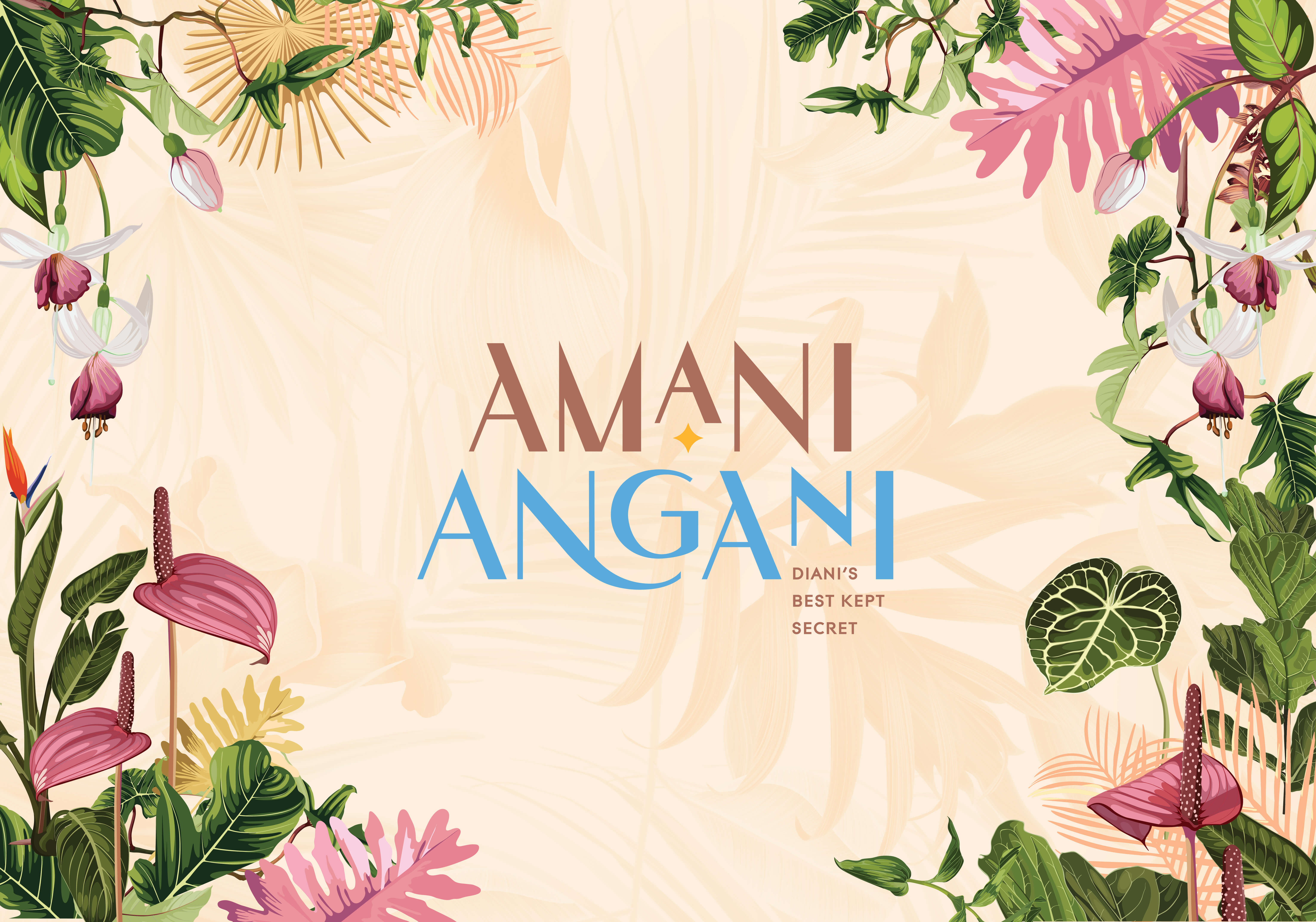
Amani Angani
Hospitality & Leisure
Amani Angani
Hospitality & Leisure
Amani Angani
Hospitality & Leisure
LET’S BEGIN WITH
A CONVERSATION.
We are always happy to meet new people. Give us a call

LET’S BEGIN WITH
A CONVERSATION.
We are always happy to meet new people.
Give us a call +62 812 8430 3232
email info@rubic3.com or follow us.
INDONESIA
SINGAPORE
©2024 Rubicube Group. All Right Reserved
Powered by Astatek
LET’S BEGIN WITH
A CONVERSATION.
We are always happy to meet new people. Give us a call